For years, I walked by a colleague’s door – a member of the Graphic Design Faculty – that had a poster proclaiming:
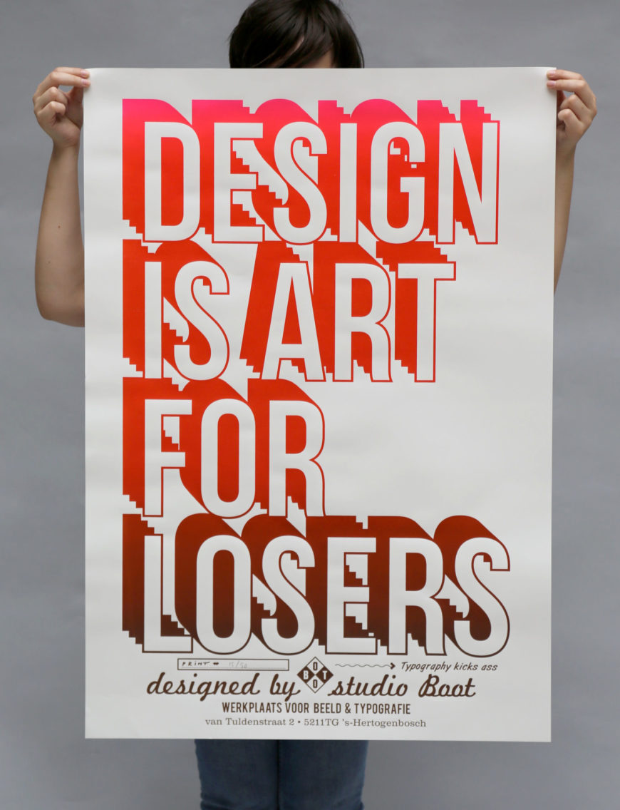
It always struck me that an equally self-aware (and self-deprecating) member of the Fine Arts Faculty could have the opposite poster on their door: “Art is Design for Losers”.
In the end, I have sort of hewed toward the following two sentiments, expressed by people far more worthy than I, and in far more thoughtful terms:

And, from Robert Capa:
“Art is some guy using a medium to change how you see the world. Whereas design is changing how we live in it.”
(Sorry, but Robert Capa, as a photographer, doesn’t have a slick graphic . . .)
The gist of what I am getting at, however, is that the two are not all that far apart in many respects – though they are often forcefully separated.
Trade Shows can often highlight both the differences and the similarities, and the most recent Salon event here in NYC was a good example of how the two coexist quite comfortably. While I normally prefer shows that feature experimental works rather than established (and expensive) ones, I was lucky to know a design team that was being exhibited in Adrian Sassoon’s booth; and, free ticket from them in hand, I ventured into Manhattan.
As is often the case – experimental or established – these shows really highlight the importance of knowing one’s materials.
The aforementioned design team – Vezzini & Chen – are a perfect example of this: Cristina Vezzini works with ceramics, and Stan Chen works with glass, and the two meld their pure expressions of their materials in remarkable lighting pieces. The two have been honing their craft since meeting at the RCA in London, and have produced memorable pieces all along the way.
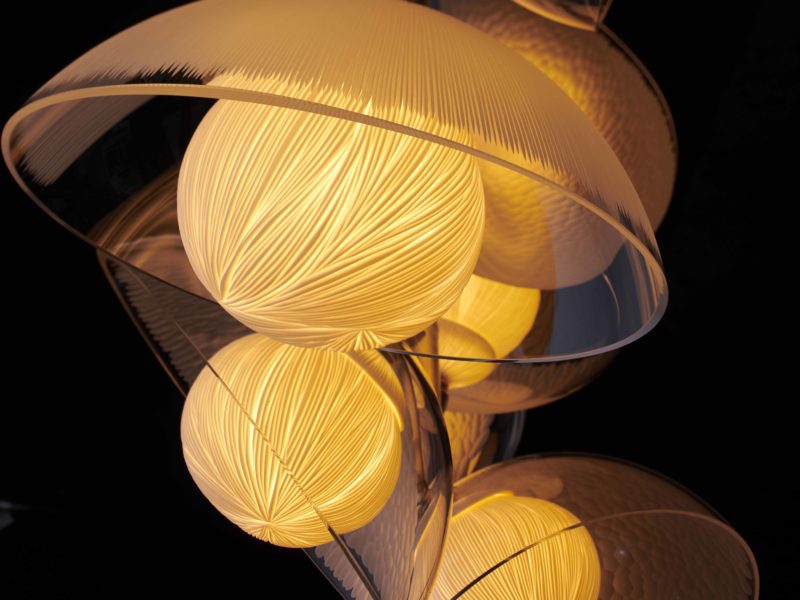
What I love about their pieces is that both of the materials work with light in different ways, and they exploit those qualities in many ways that are so similar, and yet so different.
On my way to their booth, however, I was struck by the work of Mathieu Lehanneur.
So were others . . .
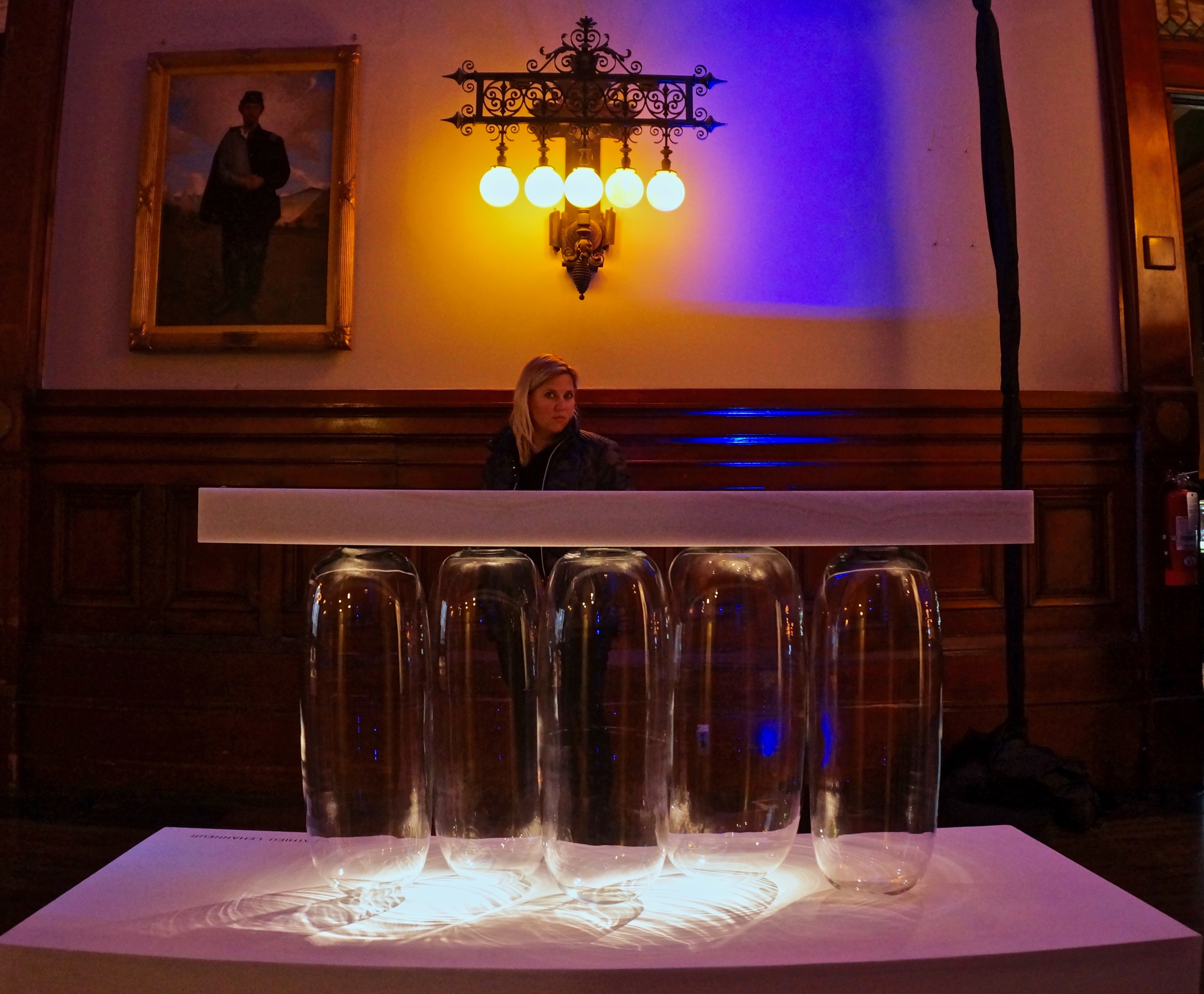
The title of the collection from which this piece comes is Inverted Gravity, one of the more engaging titles around – and far more understandable in this photo:
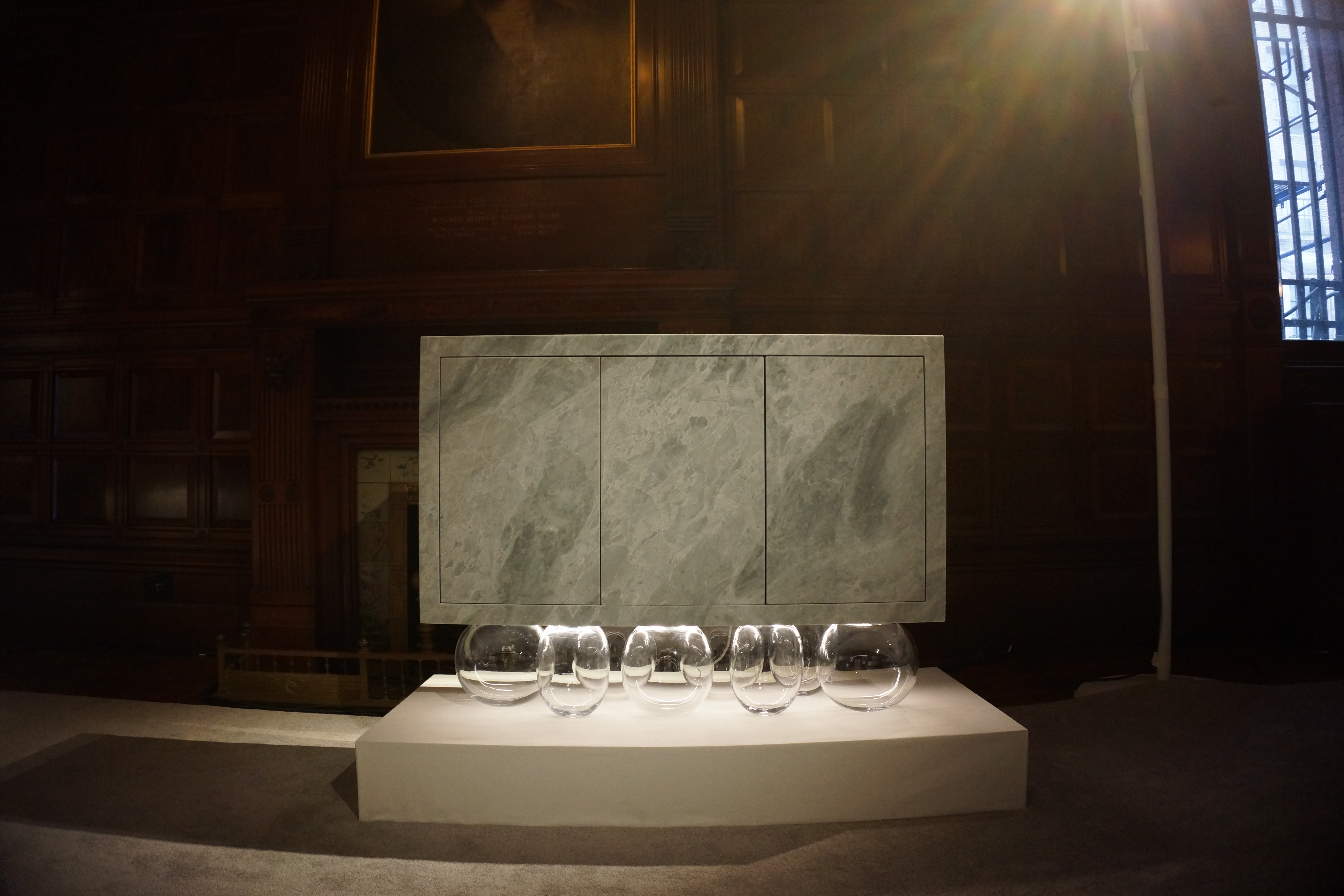 Obviously, the pieces are dramatic on first sight: the title only serves to drive home the point that the designer is playing with.
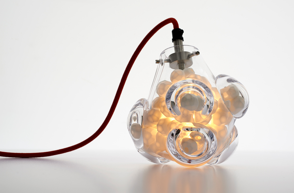
Our brains expect to see materials like marble on the bottom of objects – and glass on the top. That we are able to slice thin stone veneers with great accuracy, allowing “stone” to live in places that it couldn’t before, slightly undermines the fact that glass as a material – while brittle – is quite strong. Lehanneur’s glassblower subjected an initial bubble prototype to some 250 kg of weight without incident.
In this scenario, the designer is deliberately playing his materials against type, while still celebrating their inherent properties and qualities. In other pieces, however, Lehanneur cuts across these elements, creating pieces that defy their material origins.
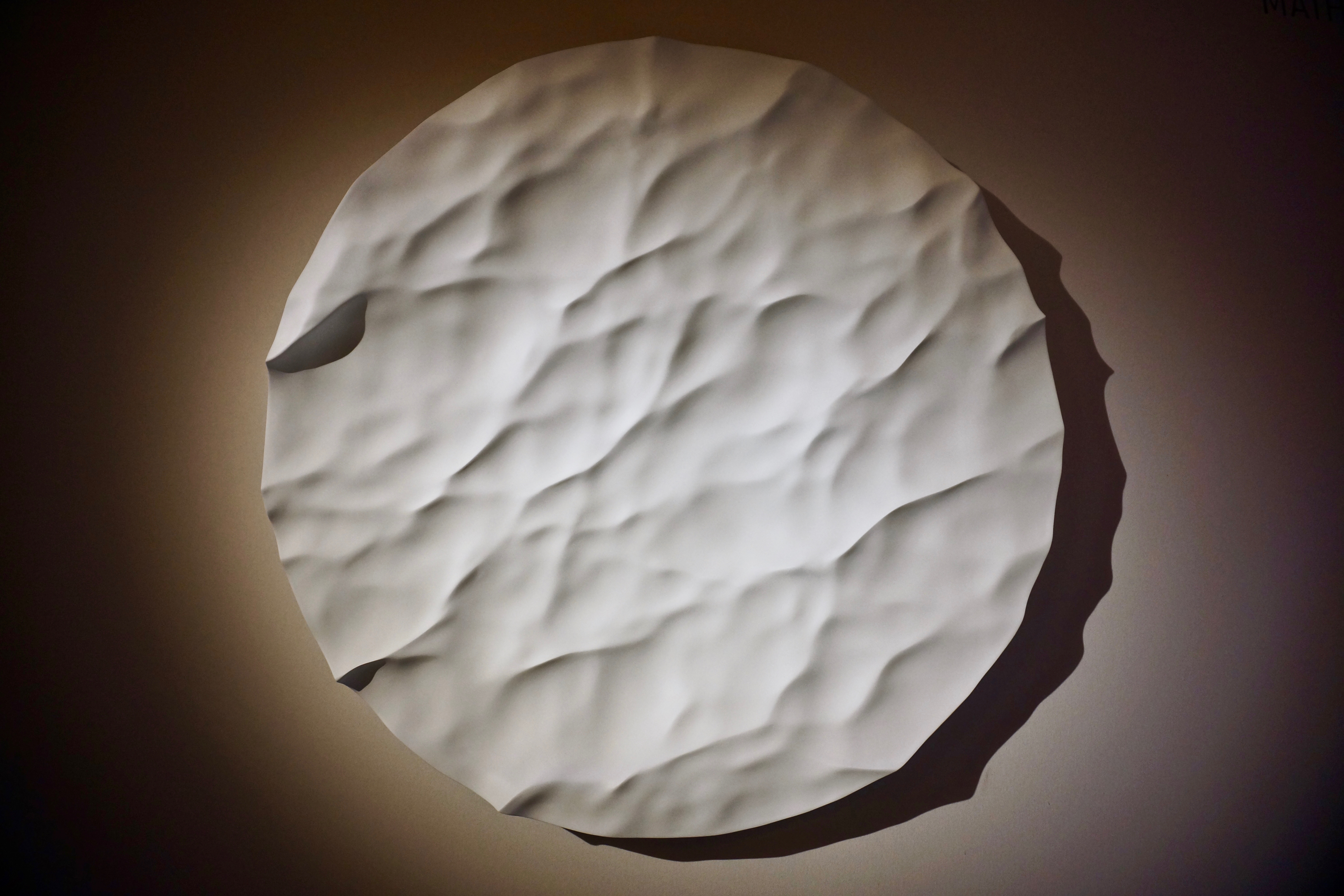
I’ll be honest, I was ready to pull out the hatchet on this piece: so many artists/designers are enthralled with the ability to “quickly” and precisely mill hard materials, that they forget what they are doing (or, they know what they’re doing, and I find it wasteful . . .).
I thought that this piece was CNC milled from a solid piece of marble, which – while enthralling in its delicate presentation, and running counter to marble’s solidity . . .
would be a tremendous waste of material. I was, therefore, excited to hear that the piece was cast from marble powder and resin – a much better use of material.
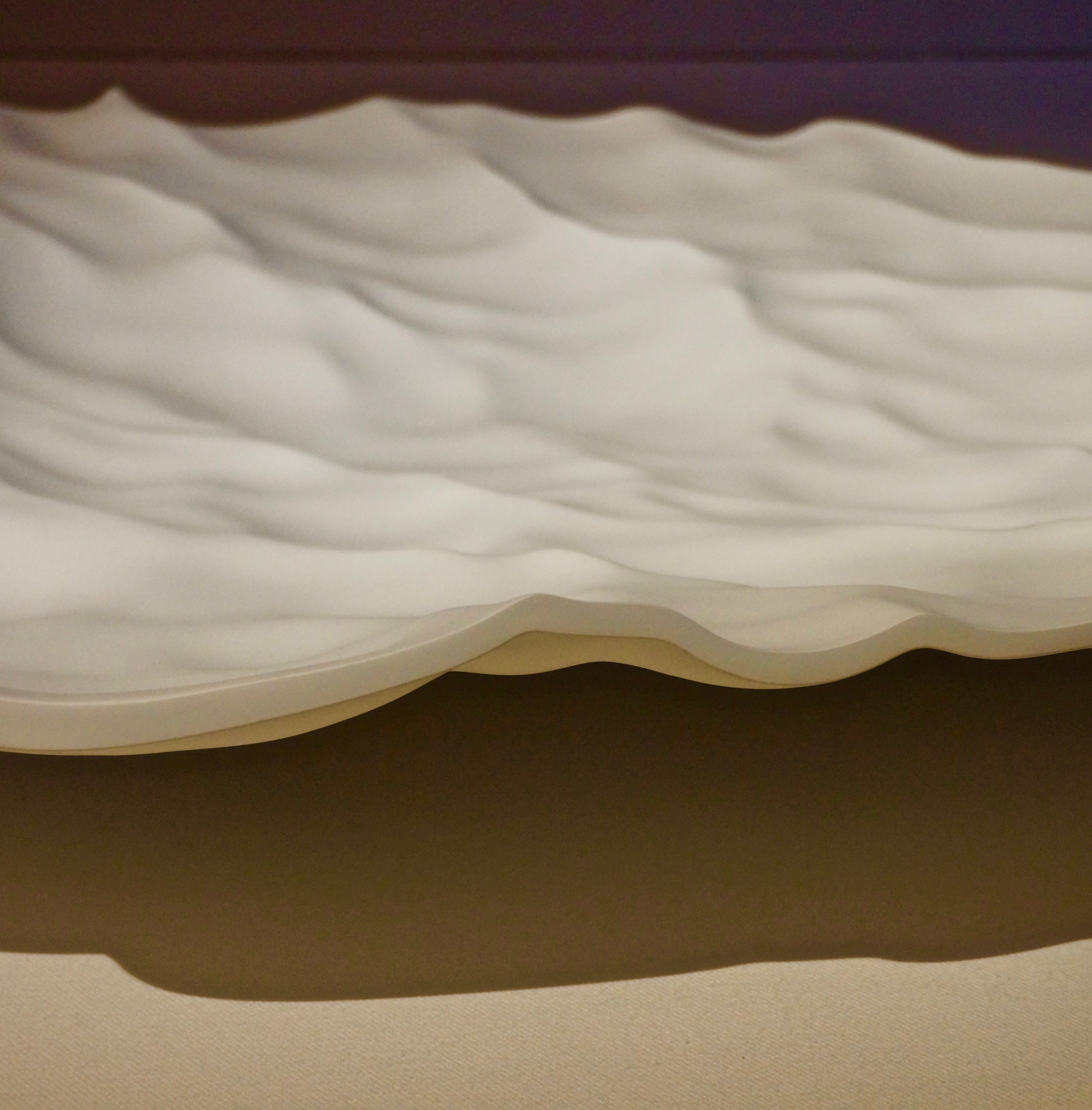
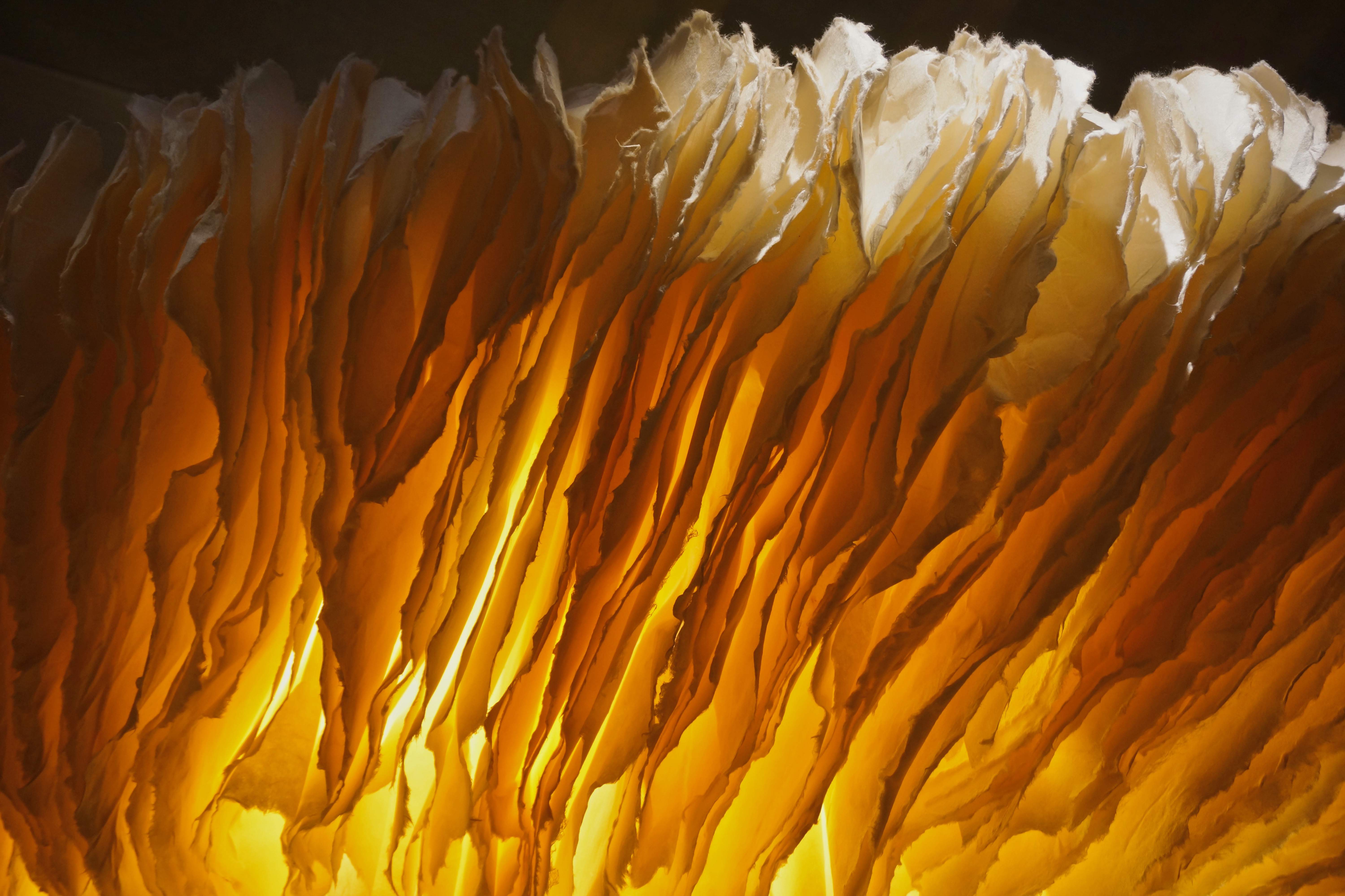
Moving to the back of the room, there was an equally delicate and enthralling – and circular – piece.
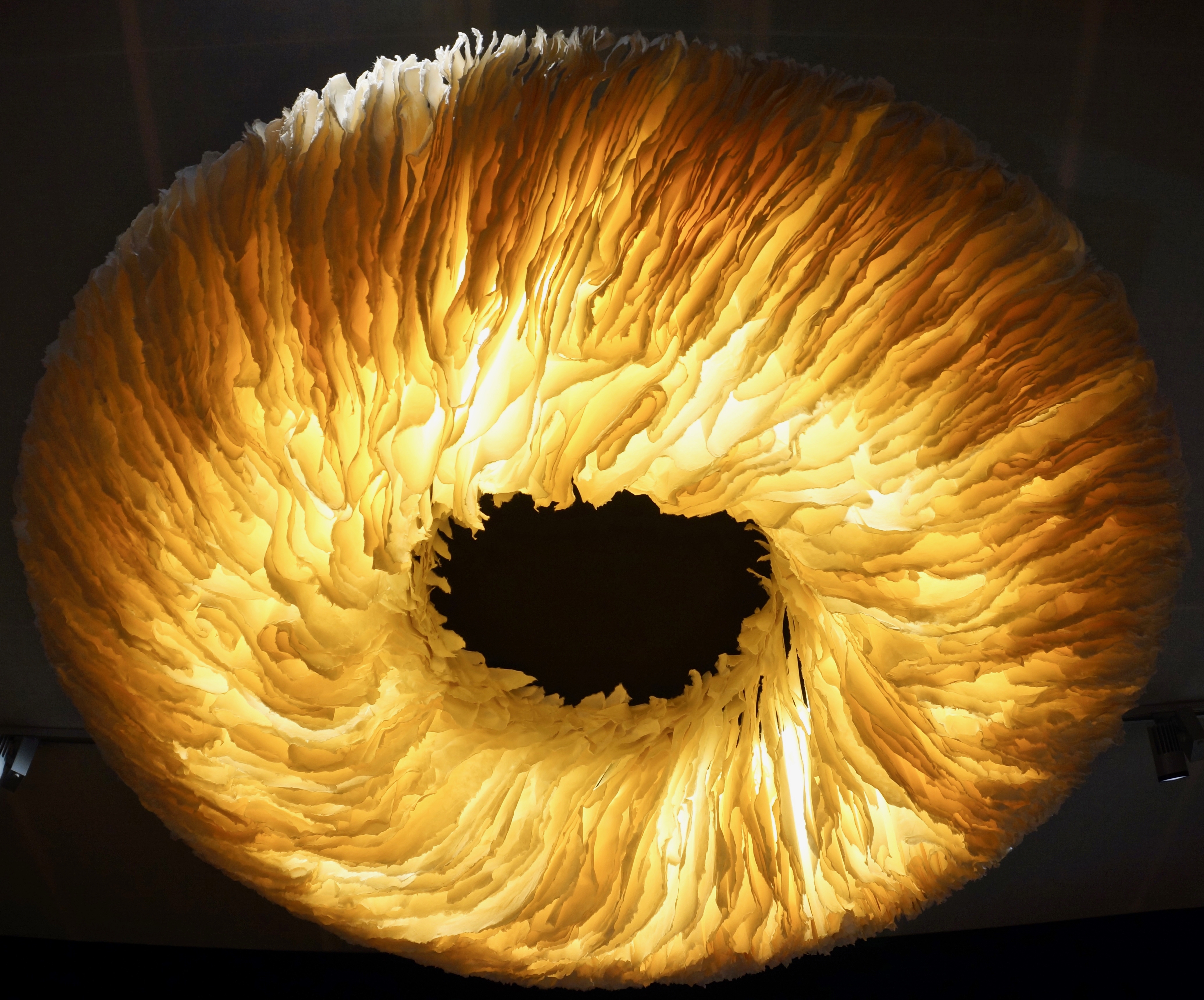
We could get into a larger discussion of depicting a Black Hole – the expression of infinite gravity – using paper, but I would prefer to focus on the use of paper – Washi paper, specifically – in lighting. This, one of the most humble of materials, becomes absolutely transcendent when applied to lighting; and the use of it in layers like this is absolutely amazing.
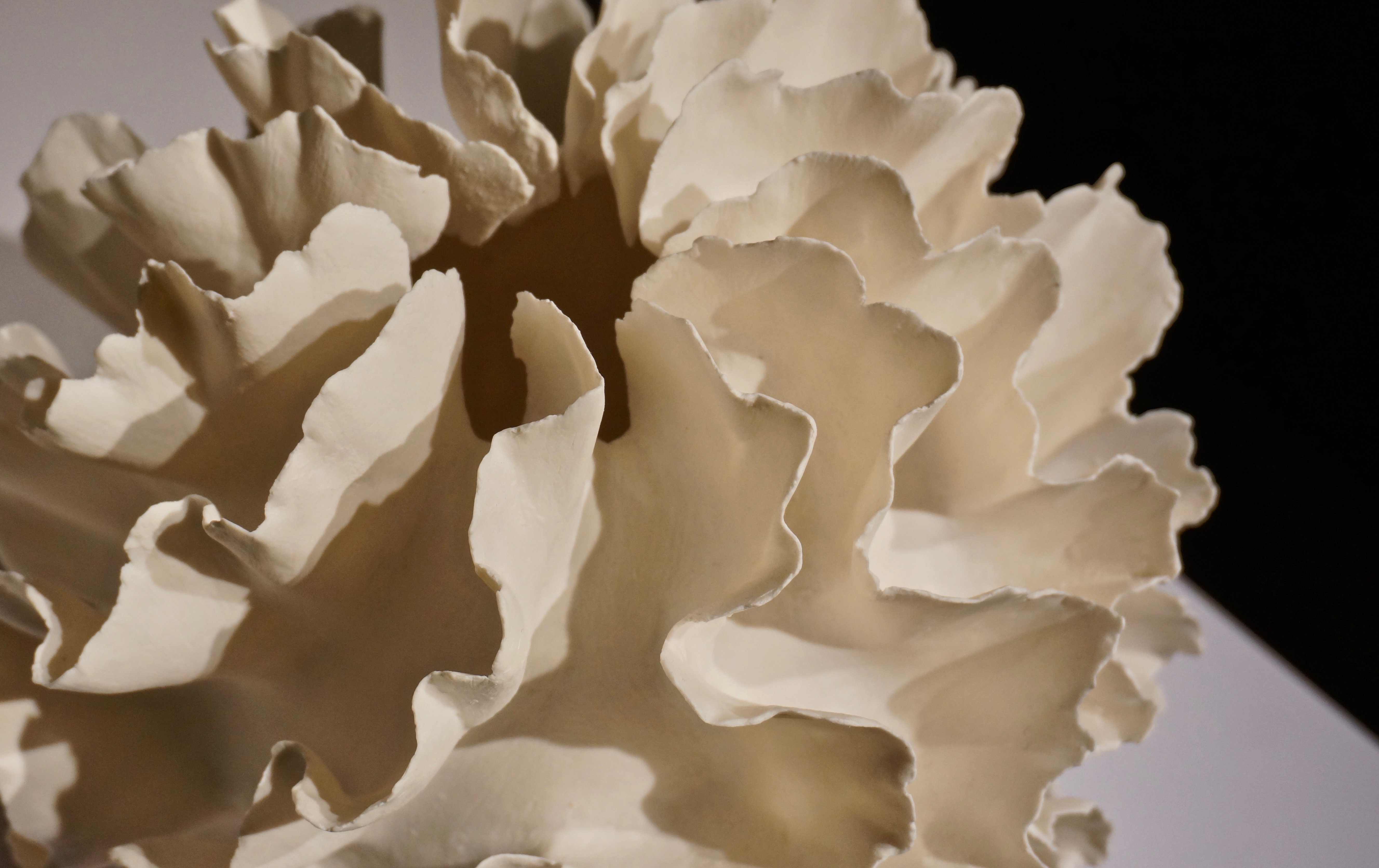
I had initially wondered if the material was paper – or ceramic. Paper is usually considered too mundane for such a headline piece, and ceramic or porcelain can have the same translucency and papery feel. While the light was, indeed, paper, there were wonderful pieces that exhibited the same look – in ceramic . . .
When we come back, we’ll get back to lighting – and back to a more traditional material for it: glass.